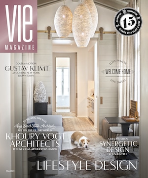


vie-magazine_Suzanne_Pollak_Herojpeg
The Power of Color
By Suzanne Pollak
The next time you are in a museum standing in front of your favorite painting, think about how the artist used color to create the mood and, as a result, also to shape the emotional impact you feel. From the soft, airy colors used by impressionists to represent the natural life outdoors to the concentrated color rectangles—almost vibrating—used in Rothko’s later works, artists use color to convey human emotions, and not just ours, but their own. The colors we use to paint our homes are no different: our palette choices create a mood, evoke emotions, and communicate with us, whether we live there or are just visiting.
The decisions we make about interior color are hugely important. While furniture and other objects support the room’s purpose, color brings it together. When it comes to your home, first consider the proportions of the room, then the color, then what’s in the room.
In Africa, where my family lived in dozens of US government-owned houses, we carried our furniture and belongings with us, including bookshelves to hold the thousands of books and records my father collected. But we unpacked without ever changing the interiors: each house had the same bland wall color. I suppose it was because, in those tropical and subtropical climates, the color was outside, in the gardens and views.
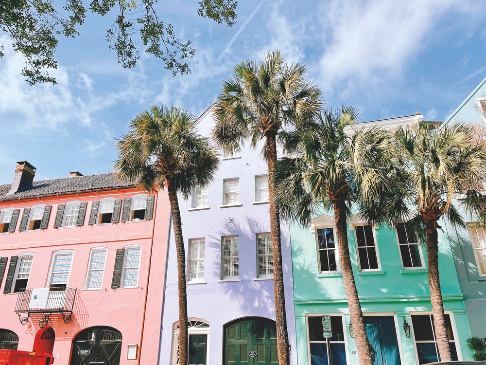
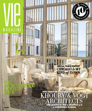
The iconic townhomes of Rainbow Row in Charleston, South Carolina
As a result, when I had my own house to design, wall color remained a mystery. I was color clueless. But at the time, I figured, “How hard could this be?” If I like light gray, why not use that? However, when the color went on the wall (I was too inexperienced to test different shades), the gray was uninspired and didn’t move me. The truth is, at the time, I didn’t know about the connection between color and the experience you have living with it—my understanding of the role of color came years later.
In my next house, I was under the tutelage of architect Jay Dalgliesh, whose work transformed many historic properties throughout the East and Southeast Coasts. When Jay suggested apricot paint for the dining room walls, I had my first color epiphany. The apricot shade he chose was distinctive enough to highlight the architectural details but also luminous and softly complementary for everyone who sat in that room, an elegant backdrop for entertaining. Then we painted a tiny upstairs study forest green, and reading in that dark forest space felt totally different than eating in the dining room with the lighter, enhancing color. The deep green room made me feel focused and cocooned, while in the joyful apricot dining room, my mood shifted to social. I could easily understand how each color supported the use of each room—I guess you could say I saw the light.

My learning curve increased dramatically when I was lucky enough to work with Donald Kaufman and Taffy Dahl, pioneers in the field of architectural color who are widely known for designing palettes for unique locations and geographies. We applied their expertise in restoring a 1780 antebellum mansion made of tabby (often called “coastal concrete” for its use of sand and oyster shells) in Beaufort, South Carolina, and the colors they chose for our house were stunning. Flowing seamlessly from room to room, the colors shifted slightly (subtly changing the mood) during the time of day and seasons of the year, all depending on the outside light, thanks to the way the Dahls formulated their paint.
My third color professor was extraordinary jewelry designer James de Givenchy in our Charleston Rainbow Row house. As someone who understands the contrast of gemstones against metals, James played with layers of colors, choosing pale sapphire hues for connecting living rooms and ruby red for a tiny powder room, with all Venetian plaster, which made the spaces glow with elegance. The stairwell color was James’s little joke; he chose a classic color called “Paris Rain,” a soft gray with a tiny touch of green, so we could have a little chic Parisian cloudy sky in our beautiful city, even if in name only.
It’s the foundation for everything else, and color plays a vital and rewarding role in laying the groundwork for that shared life.
I was lucky to learn under several passionate colorists, but I still have more to learn. Now it’s Maurice Bernstein’s turn to teach; he is a superb interior designer whose career started in the 1960s—with more years of experience than anyone I know.
Two years ago, Maurice made a color suggestion for two rooms in my little Charleston house. The change brought a bit of gravitas and a lot of sophistication, surprising in such a small space and unassuming house. The color showcases the objects—a weird mix of 1920s American paintings, eighteenth-century Chinese porcelain, English silver, and African art—and ties them together into a harmonious, if eclectic, whole. The colors, a luminous golden wall hue and a blue-gray ceiling (Benjamin Moore CW 380 Massicot and 717 Paradiso), create an exotic, unique, and elegant mood. Initially, I felt like I was living inside a pumpkin. Then I realized Maurice had turned the place into a jewel box.
Now Maurice is advising me on a 1920 Duncan Lee-designed house in Richmond, Virginia. While not fancy or large, the house has lovely architectural details of paneling, arches, and moulding—not too much, but just right, as you would expect from a superb architect like Lee, one of the city’s most respected professionals whose signature designs often combined elements from the Colonial Revival and American Arts and Crafts movements. And we certainly want to choose the right color palette to highlight those distinctive accents.
Choosing colors to live with reminds me of cooking dinner. Both are creative endeavors, and I find creativity to be one of the joys of domestic pursuits. With every choice we make, from what’s for dinner tonight to which interior design will continue to please, we create our life—how we feel where we eat, sleep, and communicate with family and friends. It’s the foundation for everything else, and color plays a vital and rewarding role in laying the groundwork for that shared life.
— V —
Suzanne Pollak, a mentor and lecturer in the fields of home, hearth, and hospitality, is the founder and dean of the Charleston Academy of Domestic Pursuits. She is the coauthor of Entertaining for Dummies, The Pat Conroy Cookbook, and The Charleston Academy of Domestic Pursuits: A Handbook of Etiquette with Recipes. Born into a diplomatic family, Pollak was raised in Africa, where her parents hosted multiple parties every week. Her South Carolina homes have been featured in the Wall Street Journal Mansion section and Town & Country magazine. Visit CharlestonAcademy.com or contact her at Suzanne@CharlestonAcademy.com to learn more.
Share This Story!
KEEP UP WITH THE LATEST STORIES FROM VIE