VIE_Magazine_MAY23_article_Mountain_View_House_HERO-min
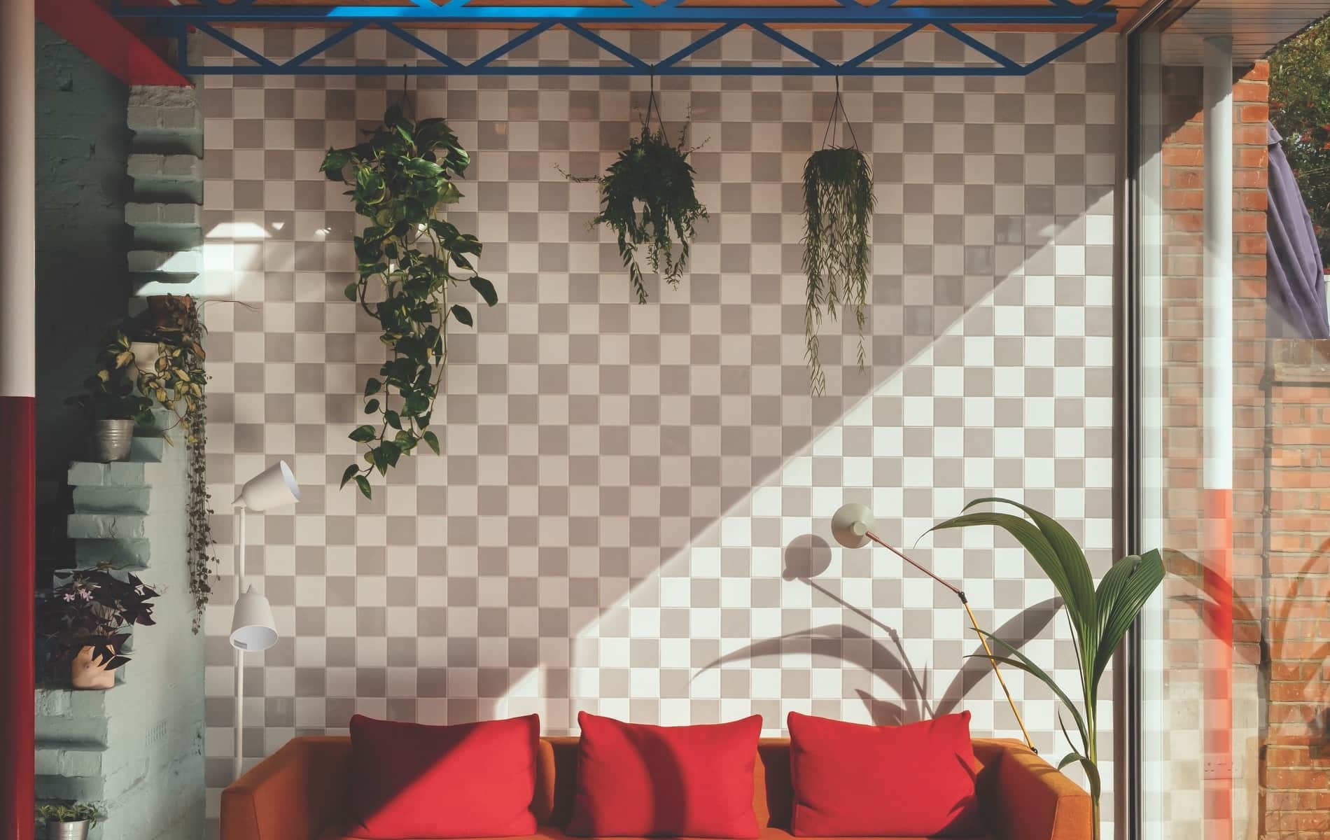
The gray-and-white ceramic tiles in the sunroom were inspired by the transparent background of digital computer programs like Photoshop—“a tongue-in-cheek ‘invisible’ wall,” says architect/owner Mat Barnes.
Edwardian Whimsy in South London
By Anthea Gerrie | Photography by Jim Stephenson, courtesy of CAN
With a theatrical living room evoking midnight twenty-four hours a day, a faux-Matterhorn framing the back porch, and a set of McD golden arches taking pride of place in the kitchen, you could suppose the home of Mat and Laura Barnes was the playful creation of an American architect. However, Mat is British, and the award-winning home he designed for his family and named Mountain View is a classic Edwardian “semi,” part of a row of identical red brick homes on an unassuming suburban London street.
From the road outside, the house looks thoroughly sober, belying no hint that the interior is a riot of color and pattern Mat describes as “taking cues from theater sets, geography, a fake Disneyland mountain, and an Edwardian bread plate.” And whimsical or not, his structural transformation of a near-derelict house has attracted top-tier recognition: shortlisted for the 2022 House of the Year award by the Royal Institute of British Architects, Mountain View won Mat and his CAN Studio the association’s London Regional Project prize.
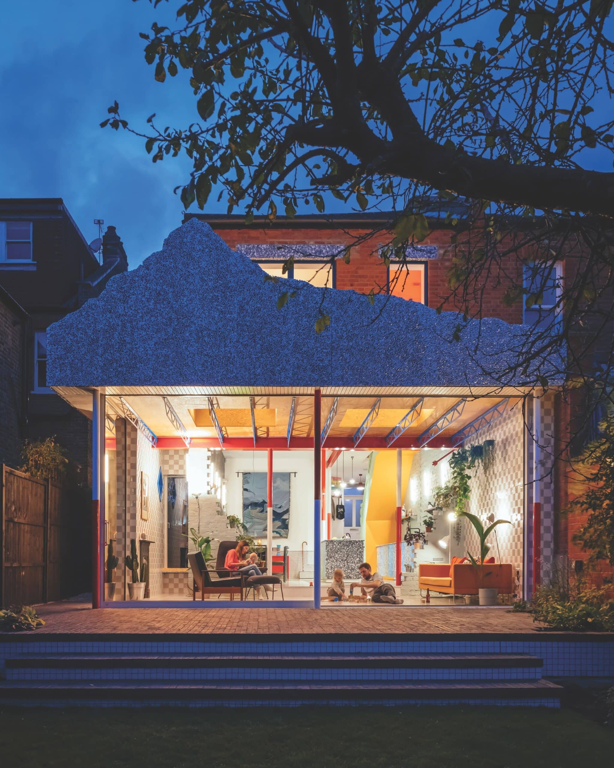
Hidden from public view, the rear facade of the Mountain View house is dominated by a cut-out make-believe peak inspired by the Matterhorn at Disneyland.
Unknowing passersby could be forgiven for supposing Mountain View was simply an ironic name for a house in a distinctly flat neighborhood, but it is, of course, a homage to the cutout of jagged peaks framing Walt Disney’s theme park Matterhorn that so intrigued Mat when he saw it in a picture. “I loved the idea of something as monumental as a mountain being balanced on a skeletal frame, and now I love hearing our daughter tell everyone she has a mountain on top of her house!” laughs the father of two.
The project dates back a few years to when the couple was house hunting and got word of an unoccupied home facing a park whose owner didn’t want to renovate it herself. “It had been empty for six years and inherited by the great-niece of the previous owners, who lives in Poland and had no interest in moving to London. We made an offer of £600,000, which was 20 percent less than market value, but it was barely habitable, with just one hot water tap. We lived in the house for the first few weeks to get a sense of how we wanted it to be—but when the ceilings fell in, we moved out!”

Close-up of the Matterhorn motif wrapping around the top of the new back and side walls of the extension to Mountain View
I loved the idea of something as monumental as a mountain being balanced on a skeletal frame, and now I love hearing our daughter tell everyone she has a mountain on top of her house!
The couple converted a small bedroom next to the master into an en suite bathroom, but the most dramatic layout changes were on the ground floor. A big step down from the original house to the patio and an even steeper drop to the garden below were modified by utilizing more than three feet of space below the old floorboards to create a new, lower floor more accessible to the garden and a huge family room with a fifteen-foot ceiling. “The height of the room brings us such joy; it feels grand and cavernous,” Mat shares.

Bricks salvaged from the original back wall of the house make stepping-stone shelves for planters at the entrance to the sunroom and garden.
The evolution of this bold, new twenty-first-century home is best appreciated from the back, where the “mountain,” carved from a thin sheet of foamed aluminum, looms high above the new glass-walled family room and wraps around the side of the house. The family room and kitchen beneath are stunning, with more geographic references (Laura was a geography major) in the dining area. Here the seating wall has been textured to resemble a cave, while the table is a bespoke ocean of dappled blue-green steel designed by Mat.
Only an architect would think of integrating fragments of a demolished original back wall into a newly extended room, and Mat is pleased he saved bricks to create stepped-up shelves for displaying plants where the kitchen steps down into the new family room.
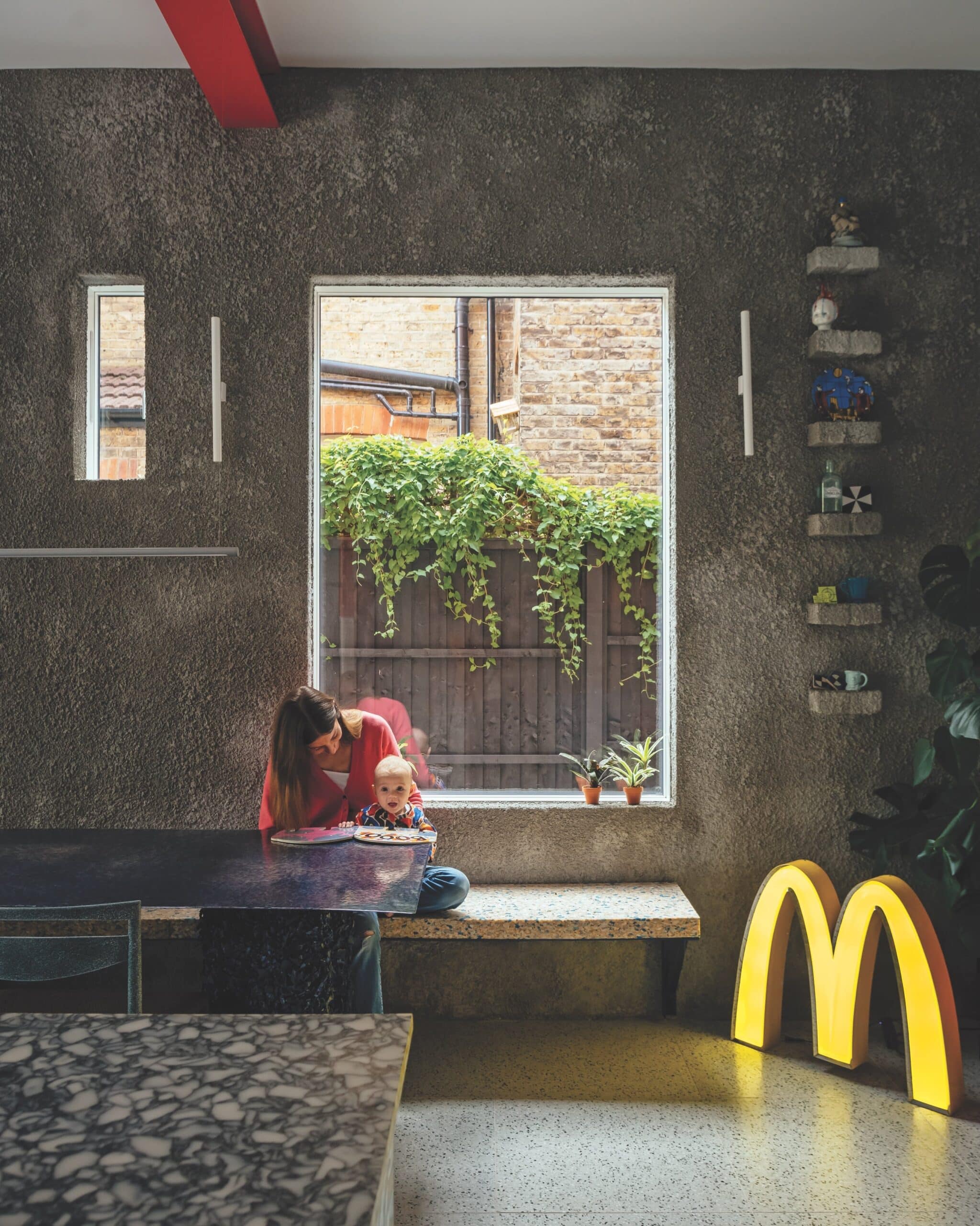
An authentic McDonald’s sign takes pride of place in a corner of the kitchen, reminding Mat of his student days working at McD.
While the McDonald’s sign—procured by Mat on eBay to remind himself of his days jockeying burgers as a student—is a striking feature of the kitchen, it’s eclipsed by the hand-built cupboards and island, which are recycled not from any old plastic but specifically from culinary items whose origins he has researched. “The blue and white is milk bottle tops, the black and white is chopping boards,” he explains.
After the Technicolor explosion of the kitchen, the living room at the front of the house—a space that would have been called the parlor back in the day and used only for formal entertaining—is a study in midnight blue monochrome. Every surface, from walls to floor to ceiling, is this exact shade of an intense, Klein-like blue, with textural interest added by architectural fragments reclaimed from a salvage yard and pinned to the wall to create a series of sculptural reliefs. “I approached a plaster works in the neighborhood and asked if they had any offcuts I could buy. They invited me to take any I wanted free of charge just to get them off their hands!”

The blue-and-white checkerboard tiles in the family bathroom were inspired by the old Victorian fireplace tiles in the primary bedroom, and a pop of tomato-color paint makes for a vibrant contrast.
We’re surrounded by so many colors and textures that it felt natural to bring so many different patterns and fabrics inside.
Exiting the living room, which the Barneses keep deliberately dark to create a sense of “moving from dark to light like walking from the shadows of the wings onto the theater stage,” it’s back to the light and playful at the tangerine staircase accented with mint-green risers and balustrade. The second floor is equally bright and beautiful, but the shades are softer beneath the sunlight. “The corridor was really dark, so we transformed it by removing a low ceiling, painting the exposed rafters pastel pink and blue, and installing light wells,” says Mat.
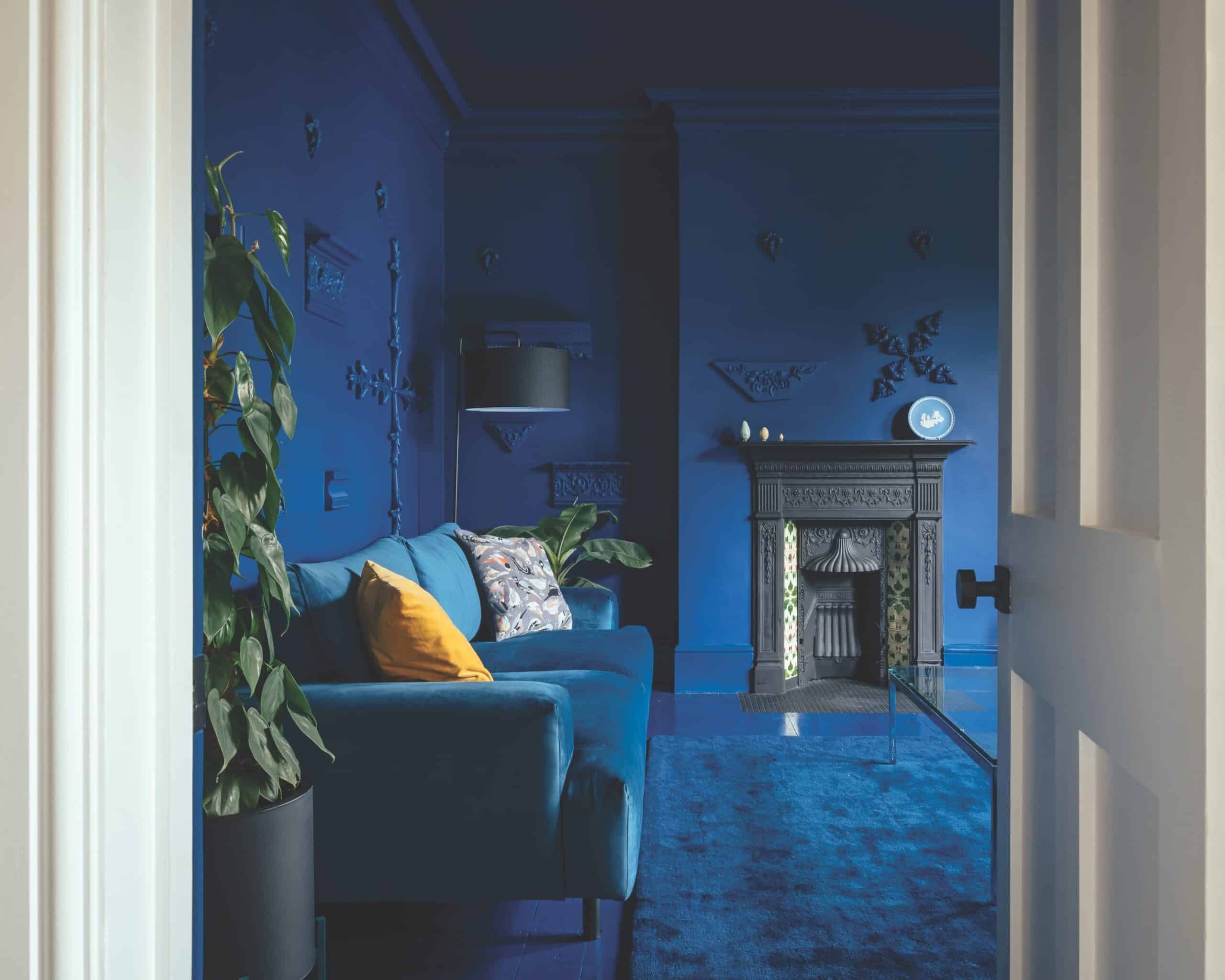
Monochrome but richly textured: the midnight-blue living room is decorated with fragments of an ornamental architectural detail from a plaster company in South London. Solid lemon and patterned cushions relieve the intensity of the dark shade across the walls, floor, and ceiling.
The only dramatic pop of color upstairs is in a bold family bathroom dressed in tomato red, which sits in striking contrast to the blue and white tiles below. The tiling was inspired by a faded patch of original blue and white tiles in front of the fireplace in the primary bedroom. Here, at the front of the house, the couple has created a new master bathroom in nature-inspired shades of leaf green, jade, and lilac—the perfect foil for a dramatic midnight-blue concrete washbasin.
While visiting can feel like being suddenly plunged into an Alice in Wonderland world, Mat argues that the surreal aspects of the decor are a true reflection of today’s fast-paced, ever-changing outside world. “We’re surrounded by so many colors and textures that it felt natural to bring so many different patterns and fabrics inside.” But he insists that however playful at ground level, the upper floor has been carefully designed to encourage a serene sleep for the whole family. “The bedrooms and hall are intentionally neutral to provide a sense of calm and quiet, and the bathroom is the only upstairs space where pattern reigns.”
— V —
For more information on Mountain View and CAN Studio, visit CAN-Site.co.uk.
Anthea Gerrie is based in the UK but travels the world in search of stories. Her special interests are architecture and design, culture, food, and drink, as well as the best places to visit in the world’s great playgrounds. She is a regular contributor to the Daily Mail, the Independent, and Blueprint.
Share This Story!
KEEP UP WITH THE LATEST STORIES FROM VIE
